
Mobile Design
Lumi
Designed during a quarter-long student-led project team, Lumi is a mobile companion app focused on enhancing personal safety through trust-based, emotionally intelligent features. Built for college students and vulnerable users navigating uncertainty, Lumi offers check-ins, emergency alerts, community insights, and a supportive mascot that makes safety feel more human.
Timeline
Mar - Jun 2025
Tools
Figma
Role
UI/UX, Branding, Logo Design
Project Summary
Lumi is a human-centered safety companion app designed to help users—especially women and marginalized groups—feel safer navigating public spaces. Rooted in research and emotional storytelling, the app blends practical tools with an empathetic brand identity. I led Lumi’s branding and created the Lumi mascot to feel like a warm, glowing buddy: comforting, alert, and always by your side.
Background & Challenge
Design for Social Good
Our challenge: How might we empower people to feel safer in uncertain environments—without overwhelming or excluding them?
Many individuals feel unsafe when walking alone at night, entering unfamiliar neighborhoods, or navigating dimly lit streets. Existing tools are either hidden behind paywalls or lack emotional nuance. Lumi set out to fix that.
“I tend to get more aware and suspicious of my surroundings at night.”
- User interview respondent
Why Safety?
From personal experiences to stories shared in our community, we noticed a strong need for a solution that could make people feel more secure when walking alone, entering unfamiliar places, or navigating cities. Existing tools like Life360 and Citizen either overwhelm users with noise or put essential features behind paywalls. We wanted to change that.
💡This project was rooted in designing for social good—building tools that empower and protect rather than overwhelm or exclude. Safety is often treated as a premium feature; we aimed to make it free, fast, and inclusive for all.
Research & Insights
We collected over 175 survey responses and conducted 9 in-depth interviews with students aged 18–21.
We learned:
-
86.9% wanted real-time location sharing with alerts
-
84.3% valued SOS functionality
-
69.3% requested smart trip tracking
-
Top concerns: privacy, app complexity, and forgetting to check in

So basically, our users wanted a simple, intuitive app. Not a high-tech maze.

Defining the User:
Meet Sierra Johnson — an energetic freshman from NYC, who’s adjusting to college life in a car-heavy, unfamiliar town. She wants to enjoy her independence while staying alert, especially when heading out alone at night.
%20(1).png)
Competitive Analysis
We analyzed Life360, Citizen, Nextdoor, and other safety tools. While popular, these apps were often cluttered, fear-driven, or behind paywalls.
What we realized: users don’t want just features—they want to feel seen, supported, and in control.
%20(1).png)
Affinity Mapping
From raw insights, we clustered user needs into actionable themes:
-
Need for fast access to help
-
Simpler way to check-in
-
Concerns about privacy and over-tracking
-
Emotional reassurance
.png)
Ideation to Features
We brainstormed independently, then merged our ideas. These became the core Lumi features:
-
SOS Button (with discreet swipe gesture)
-
Smart Trip Tracking with Safe Route Suggestions
-
Emergency Check-In
-
Community Forum (peer-based alerts)
-
Real-Time Location Sharing
Lumi’s identity had to be emotionally safe, not just technically secure.
-
Primary Color: Navy Blue - calm, focused, trust
-
Accent Colors: Soft yellow (caution & visibility), Red ( “urgency, safety is serious”)
-
Fonts: Friendly, non-intimidating, calming yet serious
Branding and Visual Identity
I led the branding and visual identity for Lumi. Inspired by the idea of warmth, light, and guidance, I designed Lumi as a glowing, expressive buddy — approachable and comforting, but alert when needed.
I wanted to balance a sense of urgency with calm reassurance.
%20(1).png)
%20(1).png)
%20(1).png)
%20(1).png)
%20(1).png)
User Flow
We mapped out the core user flow from opening the app (or lock screen widget) to reaching safety or sending an alert.
Our primary user flow prioritized speed and clarity:
-
Landing page: Interactive map with risk indicators
-
Bottom bar nav: Check-in, Forum, Profile
-
Top corner: Quick swipe to SOS
-
A → B Navigation: Heatmap overlays and ETA + community alerts
%20(1).png)
Lofi Prototype
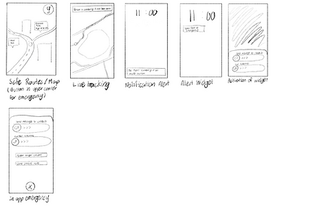.png)
.png)
Mid-fi Prototype
%20(1).png)
%20(1).png)
%20(1).png)
Hi-Fi Prototype
Finally, we integrated all of the colors and fonts to bring it to life, in addition to prototyping the final app. Here are some examples of our screens. We ensured consistency across pages and built the visual system for Lumi’s UI.
-
Emergency screen with swipe gestures
-
Check-in contact selection
-
Navigation page with route safety prompts
-
Community page with map-based alerts
%20(1).png)
%20(1).png)
%20(1).png)
Iterations Based on Testing
Emergency Contacts:
Redesigned for clarity after users struggled with editing in v1.
With our emergency contacts, our initial design made it hard to navigate through adding new contacts or editing the set emergency contacts which went against our findings in the surveys. Through the different interactions, we matched the theming of the page to the rest of the app and made it easier for a user to quickly add and edit the contacts so they can also easily access them in a time of emergency.
.png)
SOS Button:
Tested various icon+text combos — settled on icon + word for maximum recognition and speed.
The SOS feature was one of the key features and we wanted to make sure we were able to make it easy to access and intuitive to use. Therefore, we conducted a/b testing with our respondents from the surveys to see which button and icon was easiest to understand. We went from the icon only, to different colors of the icon, to the entire word, and finally to a button that had both icon and text.
.png)
.png)
Check-In:
Simplified from one dense screen to a guided step-by-step with visuals for clarity under stress.
Our check-in feature underwent many iterations, first starting off as only one page, but then becoming spread across multiple screens to simplify and make the feature more visually appealing. Based on other user feedback, we opted for more icons/visual aids to break up text and simplify the overall screen while still guiding them through sending check-ins. Under stressful situations, this extra clarity helps the user easily use our app.
.png)
Reflection
Lumi taught us that safety isn’t just functional—it’s emotional. Our users didn’t just want alerts and maps. They wanted to feel seen. My role in designing the brand helped anchor that emotional connection, reminding us that good design doesn’t shout—it reassures. We learned the importance of designing through listening to our user’s personal stories, and ultimately reflected that Lumi is more than a tool, it’s your companion.
What's Next?
We plan to:
-
Continue testing with students
-
Refine Lumi’s check-in features and onboarding flow
-
Expand Lumi’s AI to suggest safe zones and crowdsource feedback
-
Make Lumi feel even more human
Safety is not a luxury, it's a right.
Want to offer feedback? Feel free to reach out to me at jatjia07@gmail.com 😊